
Software
The Yardstick
Desktop publishing is what put the Mac on the world stage. Nearly forty years later, it is also the hardest test we can set our own modern apps, so we have made it the measure of everything we build
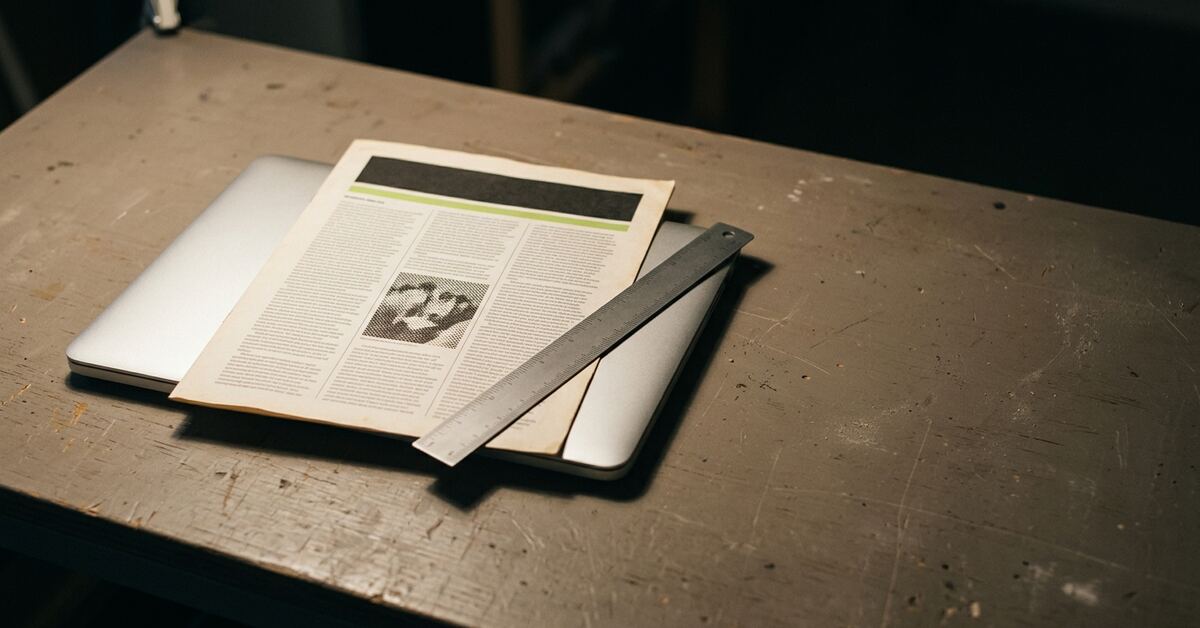
In 1985 three things arrived within a few months of each other: the Macintosh, Apple’s LaserWriter printer with Adobe’s PostScript inside it, and Aldus PageMaker. None of them was enough on its own. Together they did something nobody had quite seen before. One person at one desk could lay out a newsletter, a brochure or a whole magazine, and print it at a quality that until then had needed a typesetting bureau and a paste-up table.
Aldus’s founder, Paul Brainerd, gave it a name: desktop publishing. It became the Mac’s killer application, and the reason a generation of designers, editors and small publishers bought one. QuarkXPress, Ready,Set,Go!, RagTime, SpringBoard, Publish It! and many others followed. For years, “a Mac” and “a publishing studio” meant nearly the same thing.
There’s a nice irony in what happened next, at least for us. The kind of software that made the Mac matter has become the yardstick our own modern Mac apps must measure up to.
- 1984Macintoshthe screen shows the page
- 1985LaserWriter + PostScriptthe printer draws the page
- 1985Aldus PageMakerthe program lays out the page
Desktop publishingone person, one desk, a finished page
A quick reminder of where we are
If you read Old Over New, you’ll know the idea. Rather than bringing new things to old Macs, we are building the old world’s knowledge into a foundation that modern Mac apps stand on. That means how to read its disks, unpack its archives, speak on its network, and open and translate its documents. We keep that knowledge in kits, self-contained libraries that any of our apps can use. Disk Phoenix, the app that started it all, is being rebuilt on those kits like any other app.
Lately that foundation has started growing a family of apps on top of it, each one a modern Mac app that opens one kind of classic document and shows it the way it looked:
- PhoenixArt for paint and draw files: MacPaint, MacDraw, SuperPaint, Cricket Draw, ClarisDraw, early Illustrator and Photoshop;
- PhoenixWrite for word processors: MacWrite, Word, WriteNow, Nisus and friends;
- PhoenixSheet for spreadsheets: Excel, Jazz, Works, ClarisWorks, Wingz and more;
- PhoenixChart for charting packages: Cricket Graph, DeltaGraph, KaleidaGraph;
- PhoenixDB for databases, FileMaker first;
- PhoenixWorks for the integrated suites that did all of the above in one program, communications module included;
- and PhoenixDTP, for desktop publishing.
Each one opens the old file, shows it faithfully, and hands it on to a modern app when you’re ready, the way Disk Phoenix already can. A paid Pro version of each will let you edit it too.
- Disk Phoenix
- PhoenixArt*
- PhoenixWrite*
- PhoenixSheet*
- PhoenixChart*
- PhoenixDB*
- PhoenixWorks*
- PhoenixDTP*
- text
- graphics
- colour
- pages
- spreadsheets & formulas
- charts
- databases
- fonts
- PostScript
- movies
Today’s macOS
* planned
Why DTP is the hardest test
Try listing what a desktop publishing program had to get right.
- Pages, measured precisely. Not “roughly here” but to the point, and a point is 1/72 of an inch.
- Text that flows from one column to the next and from page to page, and wraps around a picture’s outline.
- Type set properly, with kerning between particular pairs of letters, tracking across a line, leading between lines, hyphenation and justification.
- Pictures of every kind placed on the page: bitmaps from a scanner, drawings from MacDraw or Illustrator, and EPS files that were PostScript programs in their own right. Each can be cropped, scaled and rotated.
- Colour, and not just “red”: process colours for the printing press, spot colours from a swatch book, and colour matching so that what you saw on screen was what came off the press.
- Layers and master pages, so a page number or a running header appears on every page without being drawn on every page.
- PostScript underneath all of it, because the page went to the printer as a program.
- And, by the late nineties, movies embedded in the page.
Now look at the other apps in the family. A word processor needs the text part. A drawing program needs the pictures and colour. A spreadsheet needs precise type and alignment. An integrated suite needs frames of text, pictures, tables and charts sitting together on a page. Every one of them needs some of what DTP needs.
DTP needs all of it, at once, on the same page.
- text flowing across columns
- kerning, tracking, leading the masthead
- text wrapped round a picture
- placed EPS / TIFF / PICT
- spot & process colour
- master page page number and running header
- PostScript underneath the whole page is a program
- an embedded movie later years
| App | Text | Fine type | Pictures | Colour | Frames | Pages, PostScript, movies |
|---|---|---|---|---|---|---|
| PhoenixWrite | ● | ● | ||||
| PhoenixArt | ● | ● | ||||
| PhoenixSheet | ● | |||||
| PhoenixWorks | ● | |||||
| PhoenixDTP | ● | ● | ● | ● | ● | ● |
Design for the hardest case
So we made a decision. We won’t start by building PhoenixDTP, because PageMaker and QuarkXPress files are some of the hardest classic formats there are, and we don’t hold many real examples of them yet. But every shared piece we build, from the way we store text to the way we store a drawing, colours and a page full of frames, is now designed against a written list of what desktop publishing needs. A piece either meets that list, or says clearly why it doesn’t yet.
The apps then get built in the order their files turn up, simplest first. But they’re built on foundations that are already good enough for the hardest job. When PhoenixDTP arrives it won’t need a new foundation, just the one everything else is already standing on. The simpler apps inherit DTP-grade precision without having to ask for it.
designed against
- PhoenixArt
- PhoenixWrite
- PhoenixSheet
- PhoenixChart
- PhoenixDB
- PhoenixWorks
- PhoenixDTP
simplest formats firstPhoenixDTP
built in the order the files turn up
One of everything
Designing for the hardest case turns up duplication very fast.
This week we counted four separate ways of storing a run of styled text in our own code. There was one for word-processing documents, one for page layouts, one for presentation slides, and one we had just added for text inside drawings. Each was reasonable on its own. Together they are exactly how old software got into trouble. Fix a bug in one and the other three still have it.
The rule we set ourselves for the kits applies here too: one capability, one implementation. The four text models are being merged into one, moved into a kit of their own beside the graphics kit, where every app can reach it. The same thing is happening to drawing. Instead of each app learning to draw gradients, patterns and shadows for itself, one shared renderer will draw them for everyone. PhoenixArt, PhoenixDTP and Disk Phoenix’s own previews will all draw a MacDraw pattern with the same code.
Before
- Word processing own code
- Page layout own code
- Slides own code
- Text in drawings own code
Fix a bug in one, the other three still have it.
After
- Word processing
- Page layout
- Slides
- Text in drawings
One shared text model
Graphics
Each app draws its own gradients and patternsOne shared renderer draws them for everyone
Fidelity first
DTP taught the world something else that we have taken to heart: what you see is what you get. That phrase came out of that era, and it’s the promise we most want to keep.
In practice it means two rules for everything we build.
Nothing is thrown away. When we open a classic file we keep everything in it, including the parts we don’t understand yet, byte for byte, so nothing is lost and a later version can make sense of it.
Everything that can be shown, is shown. If an old drawing has a gradient fill, or a drop shadow, or a custom pattern, we don’t shrug and draw a grey box with an apology. We find a way to draw it on today’s Mac.
Some of that work is wonderfully old-fashioned. MacDraw 1.9 offers 35 fill patterns, but its documents store only a number, “pattern 17”, not the pattern itself. The pixels live inside the application. So we ran MacDraw on an emulated Mac Plus, filled a row of rectangles with each pattern in turn, and measured them off the screen, pixel by pixel. Nineteen of them turned out to be the standard patterns Apple published for every Mac. The other sixteen are MacDraw’s own. Now we can draw them.
Cricket Draw’s fountain fills, its gradients, came out the same way: we drew shapes in Cricket Draw itself and watched exactly what it did.
- 1 · Run MacDraw
-
2 · Measure it
pattern 17: measured, pixel by pixel illustration
- 3 · Draw it today
19 of 35 are Apple’s standard patterns 16 are MacDraw’s own
The yardstick
It’s a pleasing loop. The software that made people take the Mac seriously is also the software that still asks the most of a computer: every letter placed exactly, every colour matched, every picture and page in its place, all at once. If our kits can do justice to a PageMaker page from 1989, they can do justice to a MacWrite letter, a MacPaint doodle or a Works spreadsheet without breaking a sweat.
We’re not there yet. There is a great deal still to measure, and some of the formats are proper puzzles. But we know what we’re aiming at now. Nearly forty years on, desktop publishing is still the thing to beat.